
Peloton is beginning to roll out a small, but useful, update for those members who enjoy Peloton’s power zone classes. At this time, it is still rolling out to members and not everybody has it at time of publishing. However, it appears to be launching soon for everyone, as shortly after we made this post Matt Wilpers posted about the feature on his social media.
Update – As of October 2023, Peloton has posted this is called “Peloton Power Zone Compliance” and should now be available for everyone.
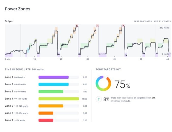
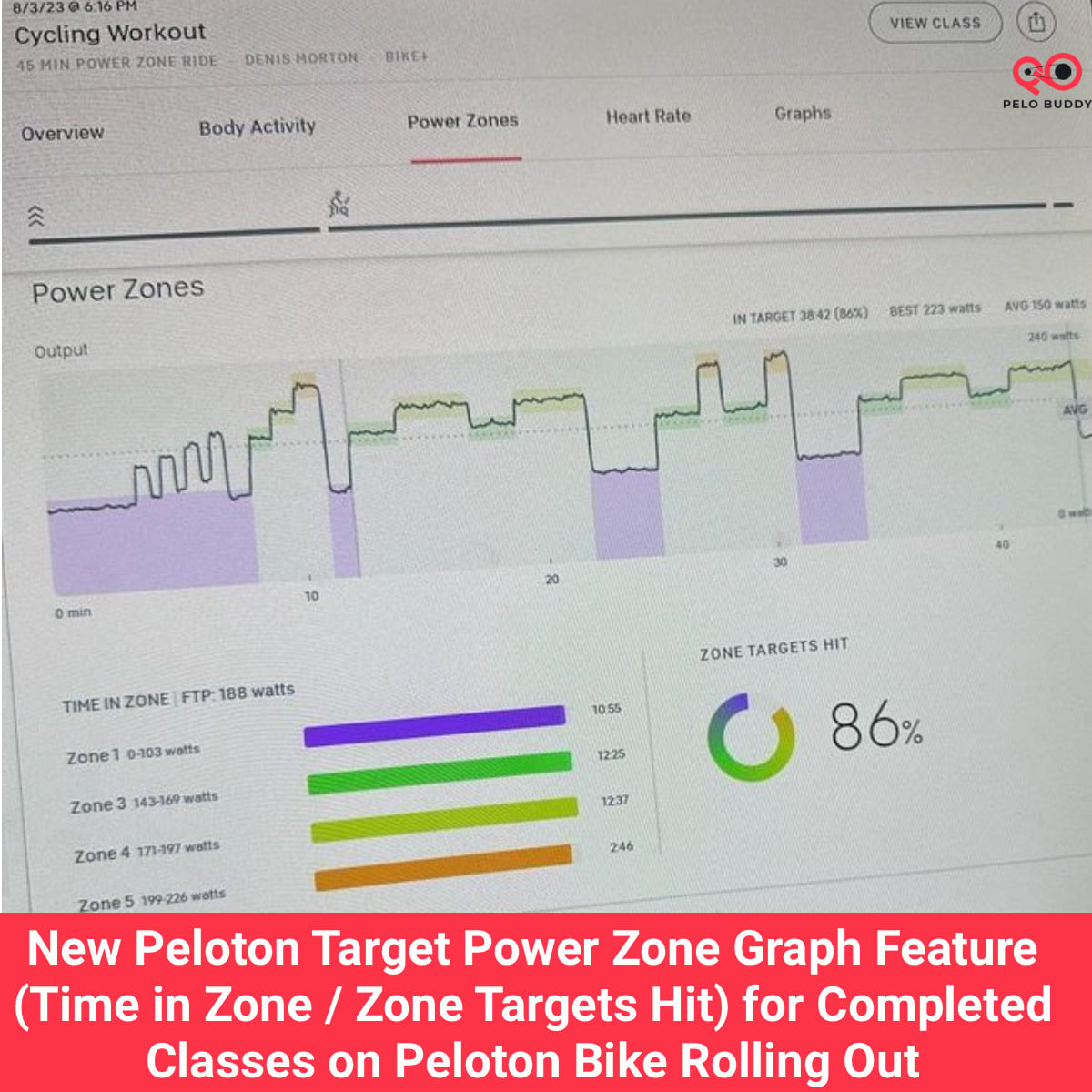
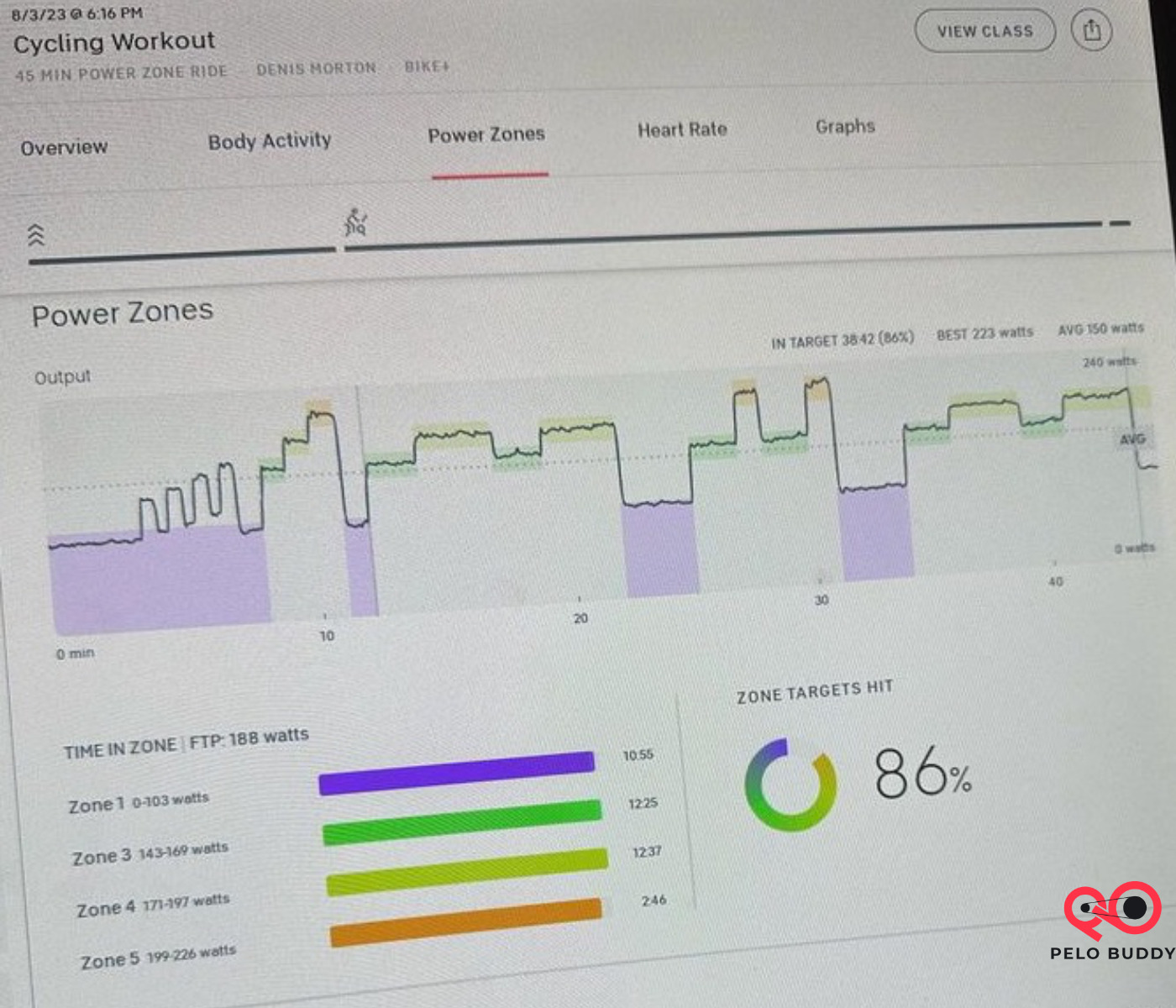
Now, in the workout summary page of a completed power zone class on the Peloton Bike or Bike+, you can see a dedicated section of information labeled “Power Zone”
In that section is a graph that visually shows you how much of the workout you stayed in each zone (also known as a target Peloton power zone graph), a bar graph, and an overall score. This is officially called the Peloton Power Zone Compliance Graph feature.
Target Power Zone Graph on Peloton
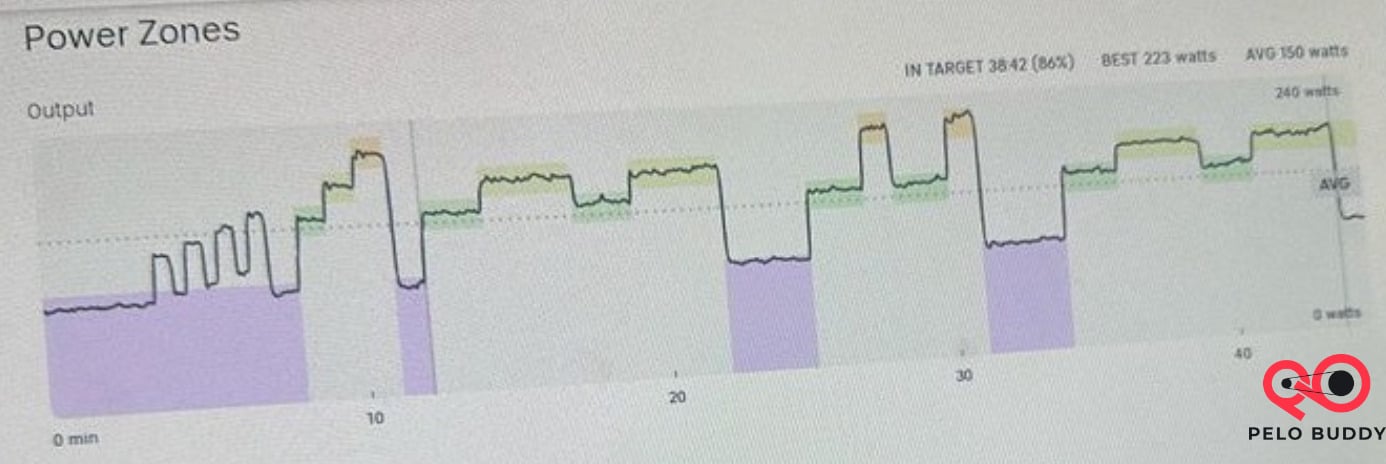
The biggest change is the new graph showing how your ride matched up to the zones called by the instructor – a target power zone graph for Peloton, or Peloton power zone graph. For years, members have had to rely on third party tools like mPaceLine, PZPack, Power Zone Plus and others to create their post workout graphs.
Now, you can see that information within the Peloton ecosystem itself. At this point, the new power zone post workout section is only displaying on the Bike/Bike+ screen itself – you can’t see the same graphs through the Peloton app (either iOS or Android), or through the Peloton website.
The UI of the post workout zone graph is different than members might be used to from the third party tools – but now that the information is on the screen and being displayed, further updates to change how the graph looks would be relatively simple to change – if Peloton wanted to.
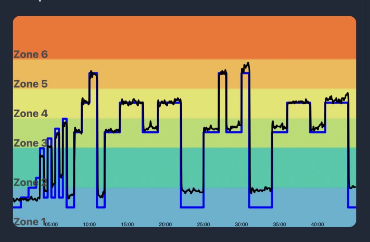
One small thing to keep in mind is that Peloton does not seem to factor in spinnups into the target zones on the graph. As you can see in the example above, when spinnups were called in the warmup, Peloton shows the target zone as a consistent Zone 1.
Time in Zones in Power Zone Rides on Peloton
The next data point shown in the new section is a new bar graph titled “Time In Zone”. There, it has a section for each zone that was called out during that ride, and color coded lines showing how well you stayed in that zone.
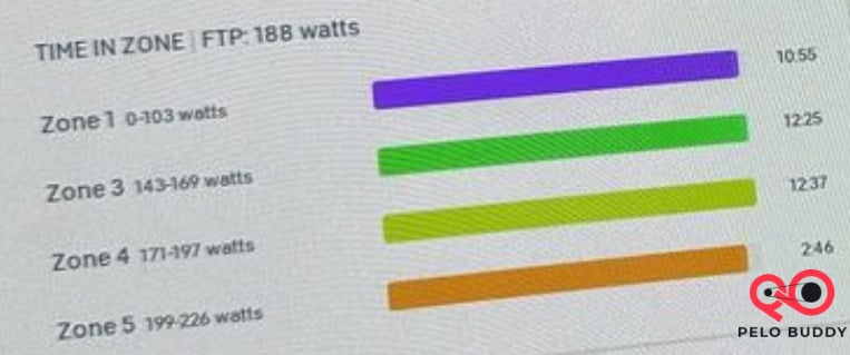
The bar graph itself is a visual indicator of 0 – 100% of how long you did. The actual number of minutes you stayed in each zone is then shown as a number to the right of each line.
In addition, your FTP at the time you took the ride is noted in this section as well.
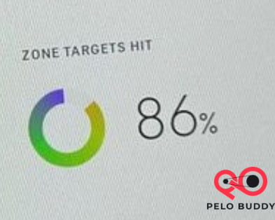
Zone Targets Hit on Score on Peloton Power Zone Rides
Finally, there is a new overall “Zone Targets Hit” score. This is simply the overall % of the ride that you stayed in the called out zone. Again, with spinnups being mapped to a consistent Zone 1, you might not find yourself hitting a 100% score depending on what effort level you typically ride your spinnups.
Thanks to #Not2Innocent for sharing these pictures with us.
While these changes won’t cover all the features people have historically used third party tools for as it relates to power zone rides, it does indicate Peloton might be planning to roll more of those features into their platform. We’ll be sure to keep an eye on any other changes.
This new target power zone graph & data is similar to another change that Peloton recently added. For the Peloton Row, a new pace target distribution score & graph was released last week, which works similarly to power zones.
If you haven’t taken power zone training classes on Peloton, “target power zones” might not make a lot of sense. You can find lots of details about Power Zone Training on Peloton’s site here. However, the key thing to note is that rather than calling out a specific resistance, the coach calls out an effort level from 1-7. Based on your current fitness (which you find out by taking something called a “FTP Test”, which is 20 minutes long), you then match your specific output to whatever zone the coach is calling out. Peloton made this easier last year with the addition of a target power zone indicator on the Bike.
If you’re a power zone rider – what do you think of this new graph & workout summary data?
Support the site! Enjoy the news & guides we provide? Help us keep bringing you the news. Pelo Buddy is completely free, but you can help support the site with a one-time or monthly donation that will go to our writers, editors, and more. Find out more details here.
Get Our Newsletter Want to be sure to never miss any Peloton news? Sign up for our newsletter and get all the latest Peloton updates & Peloton rumors sent directly to your inbox.
Do we know when this will fully roll out? I seem to be always the last to get new features. I think (no evidence) that it’s because I’m in Canada. I have enrolled in the beta program for things but have never been selected to participate in any beta testing of things as of yet. But, this I think is a great step forward and always look to see if I have it yet after every PZ ride. Sadly it hasn’t showed up yet, also no luck in receiving the entertainment feature as well.
At this point the power zone ranges in the TIME IN ZONE / ZONE TARGETS HIT feature do not match the ranges at the bottom of the screen during class resulting in lower than actual time spent in a given power zone if you are riding in the upper end of a zone.
I love this feature but the last couple of power zone classes I’ve completed, the compliance graphs were way off. Is there a glitch in the software?
I have that same question. My time in zone numbers seem way lower than they actually are.
Same problem as indicated above
When will this be fixed?
I have the same issue. The graph (and my experience during the ride) clearly shows I was in the zone called out and yet the Zone Targets Hit % will often quote a wildly different score – 26% today for what the same work in a similar PZ ride two days ago would accurately score 98%.
Frustrating.