
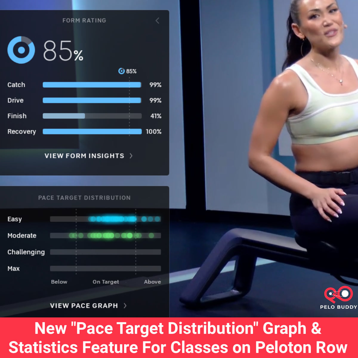
Peloton has unveiled a new statistic for members who own a Peloton Row. Called “Pace Target Distribution,” it provides a visual indicator of your adherence to the provided pace targets throughout any given class.
This is somewhat similar to the statistics available on Bike and Tread devices that allow members to view the total time and percentage of the class during which they achieved the target metrics of following the target cadence and resistance ranges called out.
For those who have not yet taken a Peloton rowing class – all of which are now available via the app for App+ and All-Access members – unlike cycling and running classes in which the instructor calls out specific numbers for pace or speed, rowers are provided a “pace target” throughout the class. There are four different pace targets called out: easy, moderate, challenging, and max.
You will never hear the instructor call out a specific numerical pace – they will instead only coach in terms of going easy, moderate, challenging, max (or recovery or drills). You are then responsible for, based on your current fitness level, picking an appropriate “Personal pace target” that maps each of those target zones to a pace range, and then going at the appropriate pace for you.
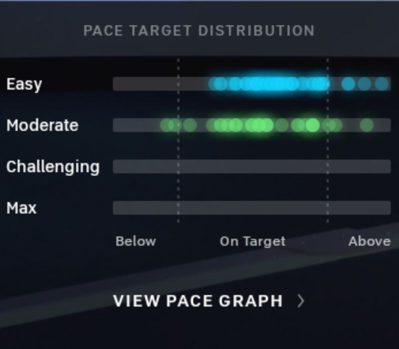
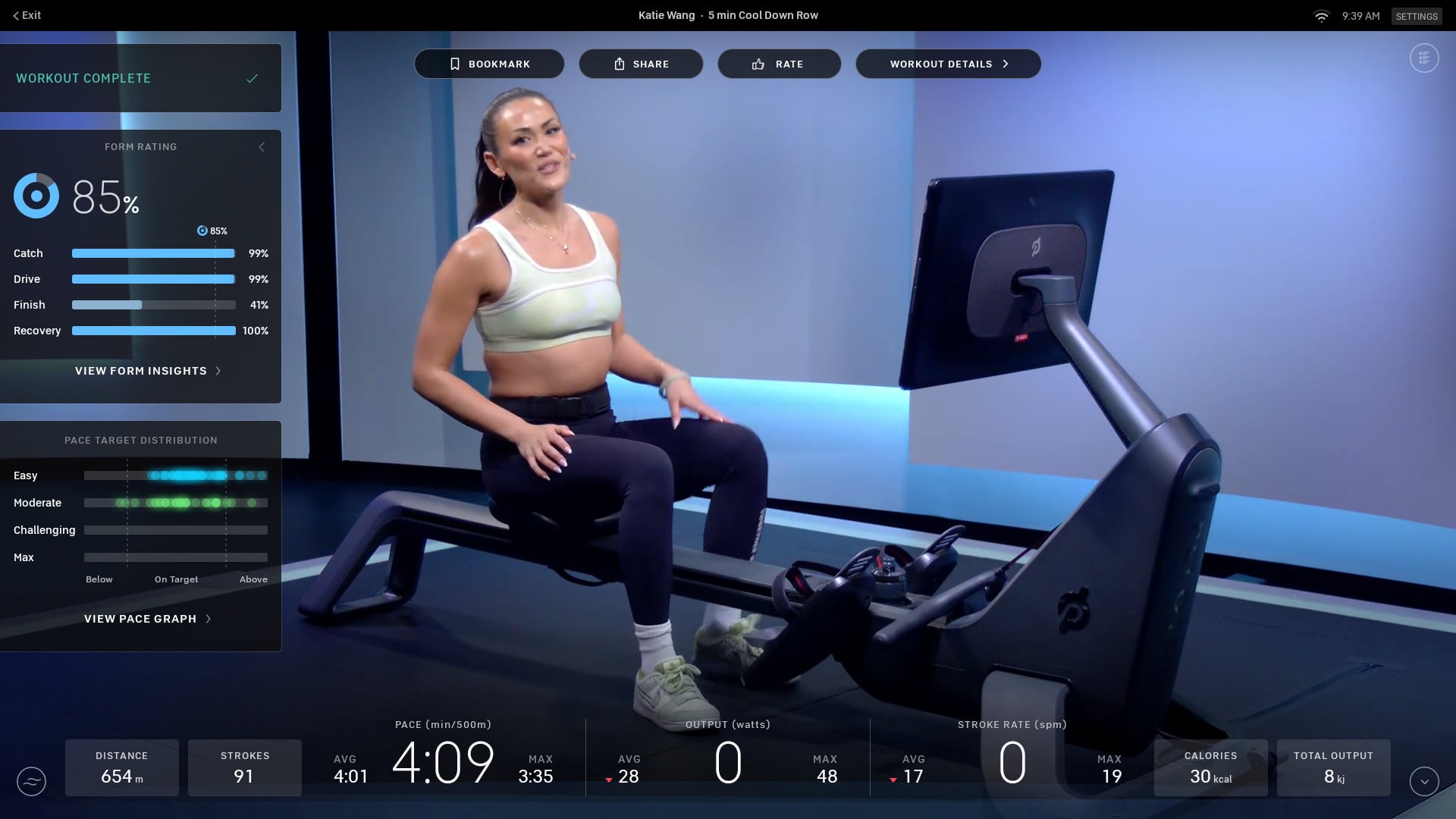
With this new pace target distribution graph, you are then given an easy visual at the end of class to see how well you followed the coaches call outs. It appears at the lower left of your screen, and shows how many of your strokes stayed within the target zone called out by the instructor.
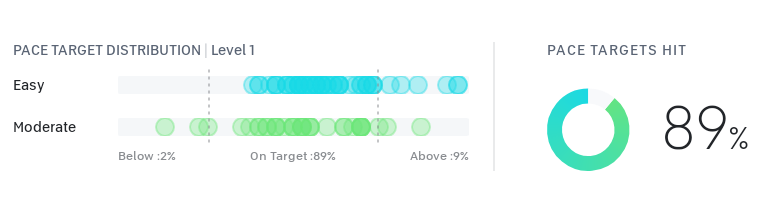
There is also a more detailed version of the graph in the profile workout history. If your pace is below the highlighted zones on the graph, it means that you were moving at a slower pace than what was called out by the instructor. If your pace is above the highlighted zones, it means that you were moving at a faster pace.
These new statistics provide an overall view of how closely you adhered to the instructor’s pace callouts throughout class.
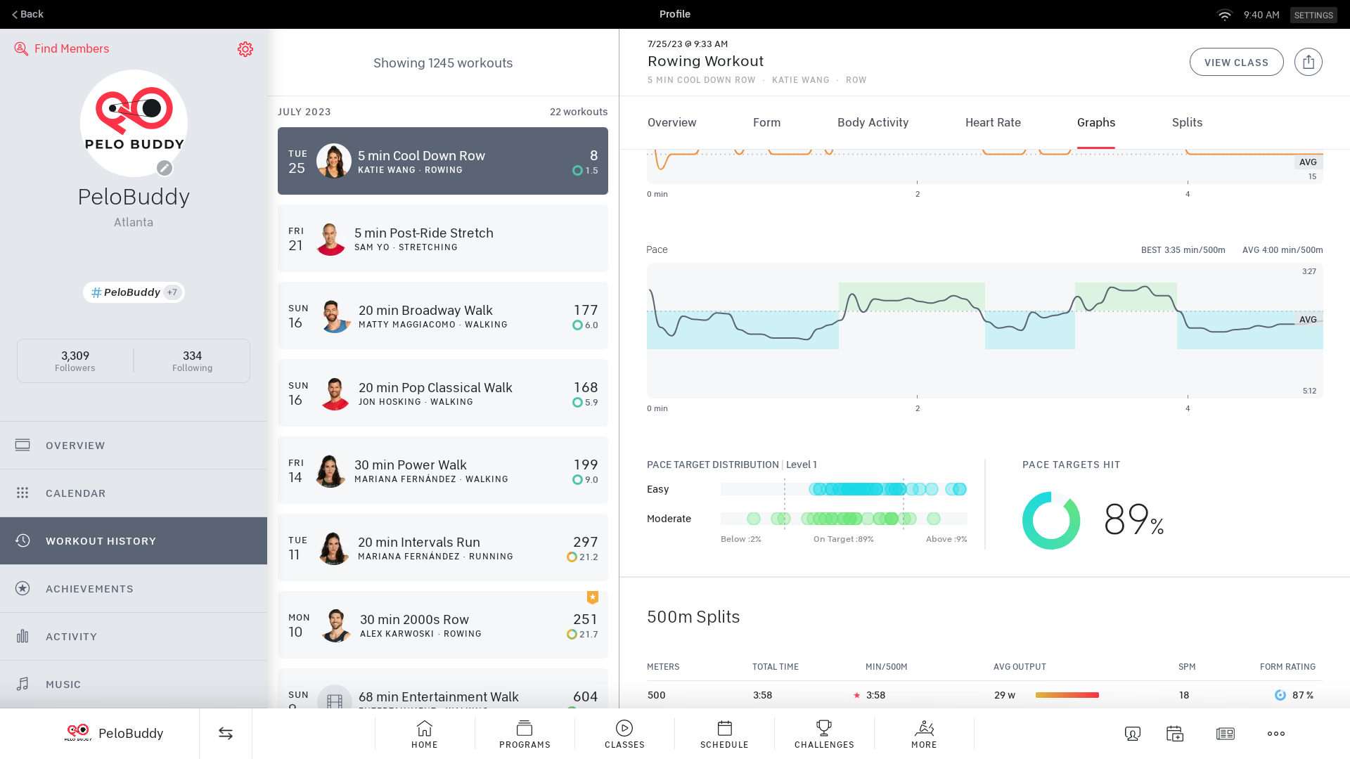
For the detailed graph version in your workout history, it also indicates what Level you had your difficulty set to for that class. You can also see the overall “Pace Targets Hit” percentage for the workout.
At this time, these same stats do not show up when viewing your completed workout in the Peloton app or the Peloton website (even if you took the class on a Row). You are only able to view these stats on the Row itself.
If you’re not familiar with the Peloton Row, you are able to pick a difficulty level between 1 and 6. As your fitness and form improves over time, you might adjust yourself to the next level after a few weeks or months.
Depending on which difficulty level you pick controls what pace range each target zone is set for. Note that “pace” is the amount of time it takes to row 500 meters, so lower numbers are faster and more challenging. Level 1 will be the easiest, while level 6 will be the most challenging. For example, in level 1 the “easy” range might be from 4:30-4:00 pace; while in level 2 the “easy” range is slightly faster and more difficult at a pace of 3:50-3:20.
Note that when you’re first getting acclimated to rowing on the Peloton Row, Peloton has a short class that provides an introduction to personal pace targets: 10 min. Intro to Personal Pace Targets with Matt Wilpers from November 10, 2022. This class is designed to help members determine which level they should start with – and ideally they will progress over time with improved form and strength, and can increase their pace levels if they so choose.
Then, members are able to take the full 3 week “Perfect Your Pace Targets” rowing program. You set your target zones in the first class, and then after the 3 weeks worth of classes, set them again in the final class based on what you learned in the program.
If you’re not yet seeing this new feature on your Peloton Row, make sure you’ve downloaded the latest software update.
Support the site! Enjoy the news & guides we provide? Help us keep bringing you the news. Pelo Buddy is completely free, but you can help support the site with a one-time or monthly donation that will go to our writers, editors, and more. Find out more details here.
Get Our Newsletter Want to be sure to never miss any Peloton news? Sign up for our newsletter and get all the latest Peloton updates & Peloton rumors sent directly to your inbox.
Leave a Reply