
Android users have a lot be excited for this week. Just days after getting an exclusive new feature, the ability to filter classes not taken by you, Peloton is back with another much-requested feature.
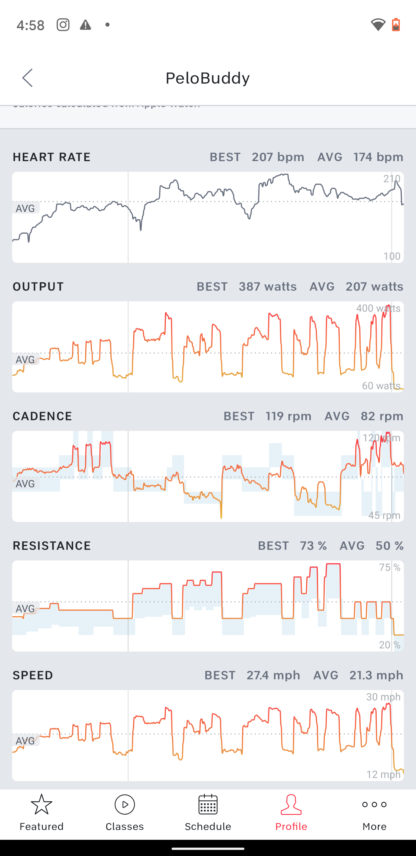
Today, Android users are now able to view workout graphs & charts of their workouts. This feature was previously available on iOS and web, however, had not yet made it to Android. The following charts & graphs are now available:
- Heart Rate
- Output
- Cadence
- Resistance
- Speed
Over the last several months, Peloton has released a slew of new feature for Android (most of which iOS users already had though). Earlier this week Android users got a new filter to allow them to see workouts *not* taken. Prior to the end of August, Android users weren’t even able to view any data of completed workouts – this was added on August 31. At the beginning of August, Android got the ability to connect bluetooth heart rate monitors.
However, there are still a number of iOS only features Android users continue to wait for – including outdoor run GPS tracking, preloading classes for offline workouts, and others. Peloton appears to be putting renewed energy into the Android app, so there’s a chance those could see the light of day for Android.
Support the site! Enjoy the news & guides we provide? Help us keep bringing you the news. Pelo Buddy is completely free, but you can help support the site with a one-time or monthly donation that will go to our writers, editors, and more. Find out more details here.
Get Our Newsletter Want to be sure to never miss any Peloton news? Sign up for our newsletter and get all the latest Peloton updates & Peloton rumors sent directly to your inbox.
I have the latest Android digital subscription (latest version Dec 2020) and it does not have any of these features. Am I understanding this incorrectly?
Can you do a post about how to read the charts? I want to know what I’m looking at exactly. Are the blue bars behind the data line where the class expected you to be? Thanks!
Yes, the blue bar is the min/max of the target metrics for that point in time for rides that have it loaded!