
The newest update to the Peloton iOS App (Peloton Digital App for iPhone) has changed the layout of information when viewing a class in the on demand library.
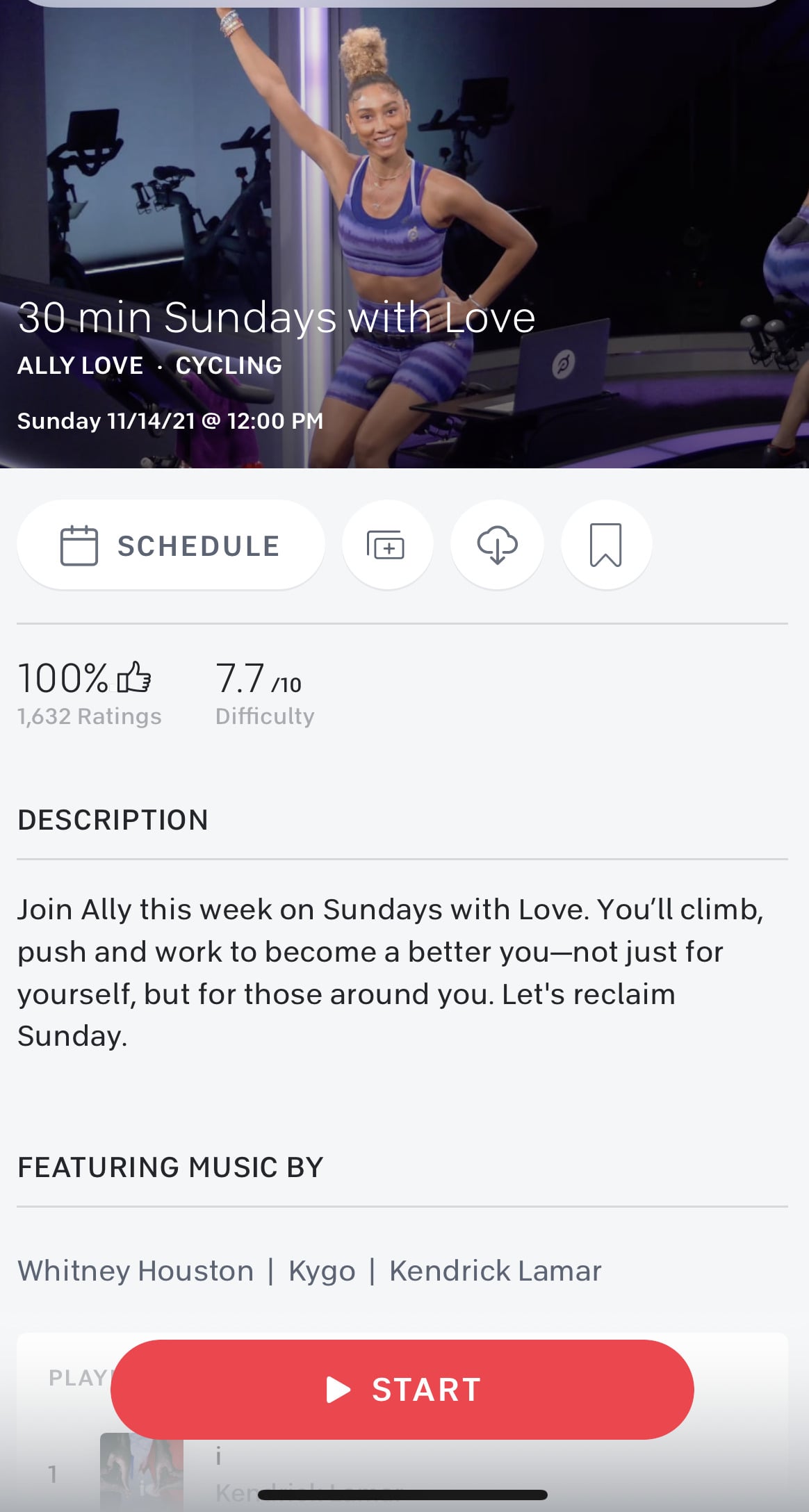
Previously when selecting an on demand class via the iOS App, you would first see the class rating and level of difficulty. Underneath that would be the class description, followed by the class playlist.
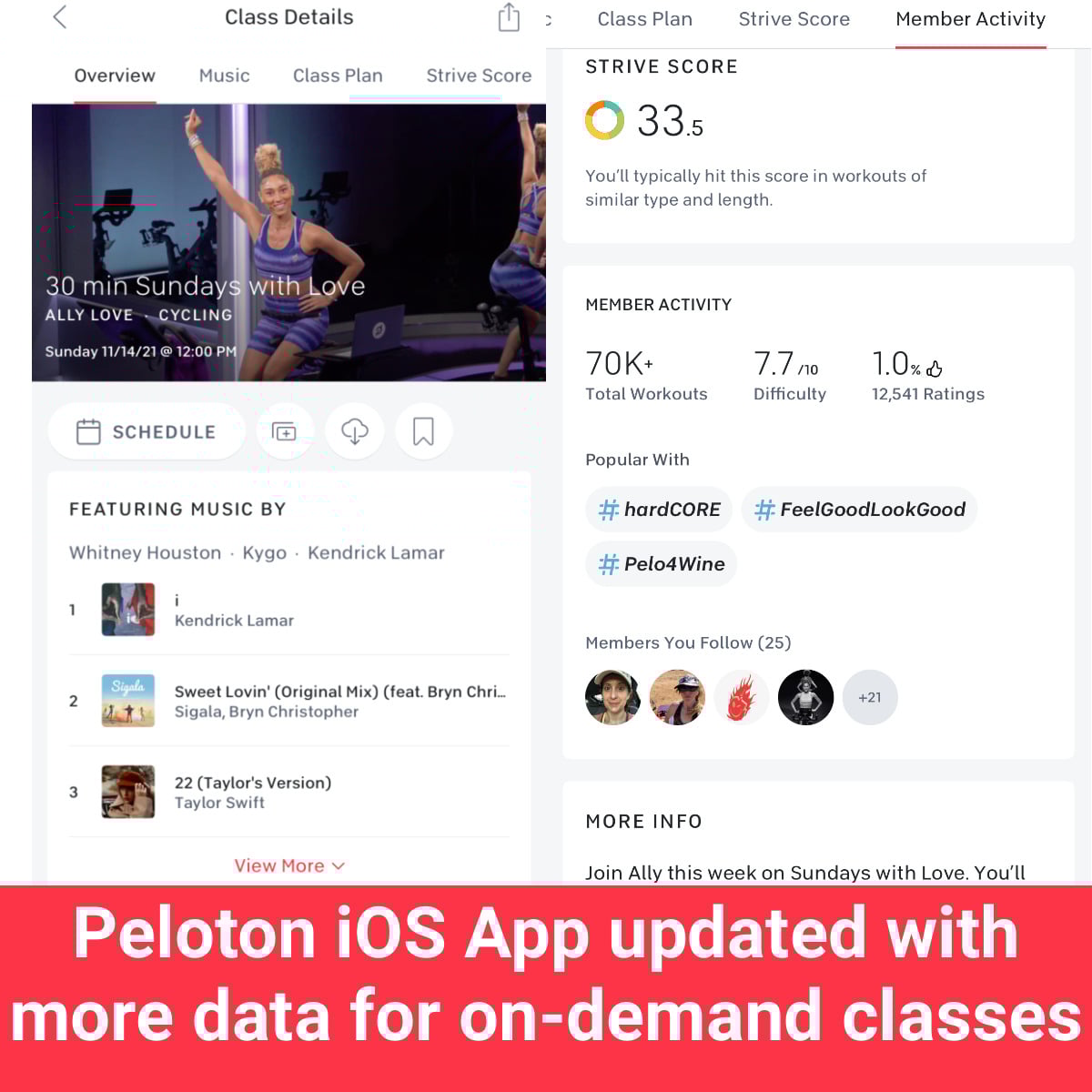
Now, the layout has been updated to look more like the format for class viewing on the Bike and Bike+. Users will see a horizontal menu bar at the top above the class thumbnail, allowing them to navigate to different sections of information about the class, such as music, class plan, strive score, member activity, and more info.
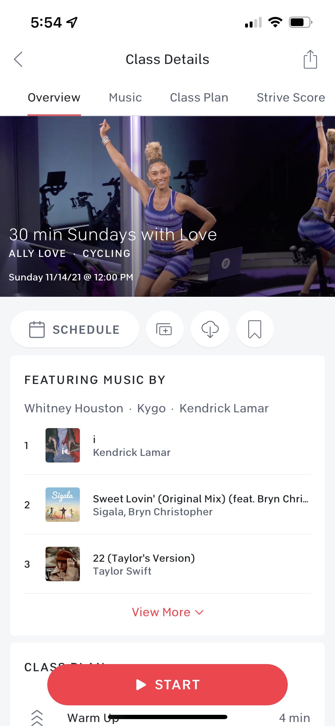
Users will still see options to schedule, stack, preload, and bookmark the class below the class thumbnail. But instead of seeing the class rating and level of difficulty first, users will now see a portion of the playlist, which they can expand to view in full. Underneath the playlist is the class plan, which contains the breakdown of time in the warm up, cycling portion, cool down, and upper body if applicable.
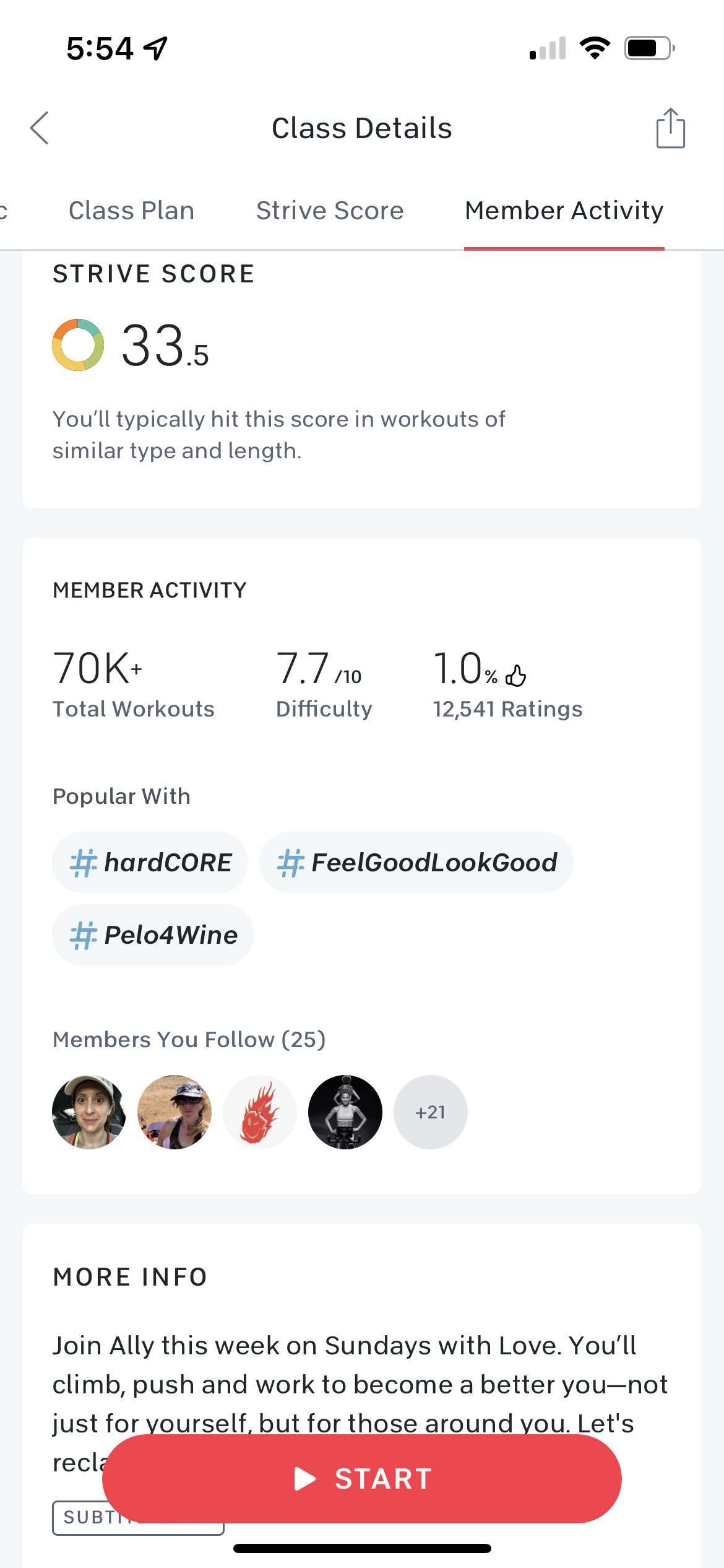
Scrolling down further will bring you to the Strive Score section, which tells you your personal average Strive Score for classes of similar type and length. Note that if your account is not set up with a heart rate monitor to enable the Strive Score feature, this box will not appear on your display.
Next is the member activity section, which contains the number of total workouts, difficulty level, and class rating. The section also displays the leaderboard tags the class is popular with, and any members you follow who have already taken the class.
There currently appears to be a small bug, whereas the rating always shows 1%. We expect that will be fixed shortly.
The last box is the “more info” section, which contains the class description and indicates whether the class contains explicit language. You’ll also see the instructor’s headshot.
What do you think of the new iOS App layout? Do you find it better prioritizes the information you’re seeking when choosing a class, or will you miss the previous layout?
Support the site! Enjoy the news & guides we provide? Help us keep bringing you the news. Pelo Buddy is completely free, but you can help support the site with a one-time or monthly donation that will go to our writers, editors, and more. Find out more details here.
Get Our Newsletter Want to be sure to never miss any Peloton news? Sign up for our newsletter and get all the latest Peloton updates & Peloton rumors sent directly to your inbox.
I prefer being able to see the class difficulty and the member rating at the top so that I could easily scroll through the classes and decide which one to do.
Agree. Prefer ratings at the top
Prefer how it was previously. I like to see difficulty and ratings at the top.